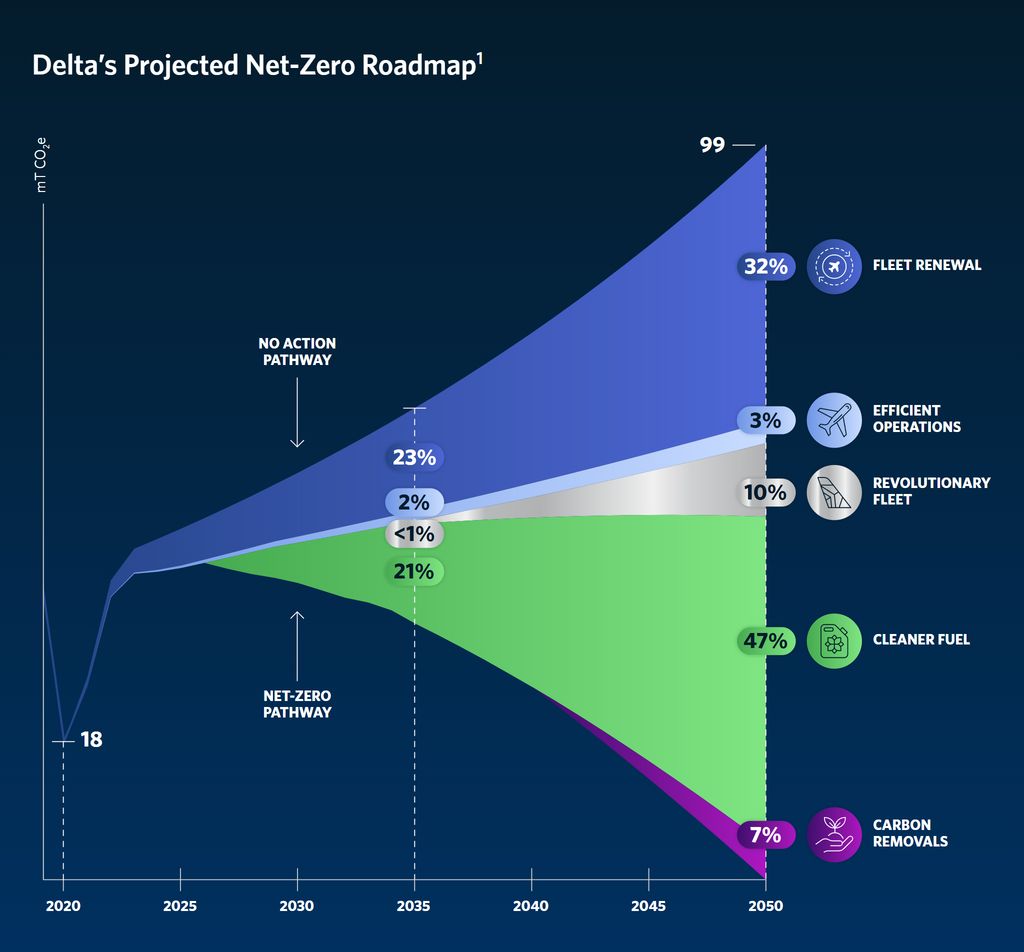
25 years of design excellence
engineered in every var()
Opinionated, mobile-first framework for SCSS.
Powered by fluid tokens and responsive utilities.
Design Tokens
01. Responsive Brand Consistency
Fluid typography, spacing, and visual effects ensure your design stays sharp and consistent across all devices and screen sizes.
We launch every new project with @purposeUI—it’s become an essential part of our workflow.
Abby Rose Blaine
Design Director, Ideas On Purpose

Utility-First Methodology
02. Speed & Scalability
Utility-first design ensures effortless scaling, delivering speed and consistency at every stage of development.
<!--
  With @purpose utility-driven fluid tokens,
  fonts scale seamlessly with minimal code:
-->

<h1 class="text-2xl">...</h1>
/**
  Traditional CSS becomes verbose,
  time-consuming, and error-prone
**/

// Mobile Styles
h1 {
  font-size: 26px; // mobile
}

// Tablet Styles
@media (min-width: 768px) {
  h1 {
    font-size: 28px;
  }
}

// Large Screen Styles
@media (min-width: 1280px) {
  h1 {
    font-size: 32px;
  }
}
Missing curly braces and other syntax-specific quirks often cost developers hours.
@purposeUI abstracts them away, boosting developer experience and reducing bugs.
Proprietary Technology
03. Limitless Customization
Our proprietary tech enables endless customization, ensuring brand consistency and flexibility across all teams and projects.
Native Performance
04. Seamless User Experience
Modern optimizations and built-in WCAG 2.2 accessibility create fast, inclusive, and search-friendly experiences across all devices.*
* As measured by Lighthouse opens in a new window on local machines or online at pagespeed.web.dev opens in a new window